By Meda Kessler
Photos by Jarrod Estes
How do you modernize a plain single-story home? You go light, bright and up.
Krishna and Damodar Shenoy loved their one-story home on a wooded lot in Grapevine, but after living there for 10 years, they yearned for something bigger and brighter.
Krishna works as a librarian/archivist at a Dallas museum and Damodar is a consultant for a global business firm. Both natives of India, they moved to Grapevine in 2001. The neighborhood gave them close access to the high school, a plus for their two sons, and to the airport for Damodar’s frequent work trips.
The neighborhood is made up of traditional brick homes, but the Shenoys love a more modern aesthetic.
“Historically, Texas actually has its own modern aesthetic in the style of Frank Welch, Wilson McClure and O’Neill Ford,” says Krishna. “I was inspired by those designs and decor and wanted to replicate that midcentury style.”
Once they decided to remodel, they sought professional help. “We had met with one architect but were not sold on his work,” says Krishna. “A family friend’s son in New York told us about a Dallas architect who grew up in Grapevine.”
Jason Smith, principal at smitharc Architects in Dallas, graduated from the school located a stone’s throw from the Shenoys’ backyard. He jumped at the chance to work on a project in his hometown and brought in David Tatum, a builder who was his high school classmate.
With the family’s wish list in hand, Smith and Tatum took the house up and out. This necessitated taking the structure down to its studs. “Only one wall remains from the original house,” says Damodar.
While the reconstruction increased the house by about 900 square feet, tall ceilings and windows, which allow for beautiful natural light, give the home an even more airy feel, especially in the main living space on the first floor. Gone are most of the interior walls and all the original dark-wood paneling. Simple baseboards and the absence of crown molding keeps the look clean. Sherwin-Williams Pearly White gives the interiors a cool feel.
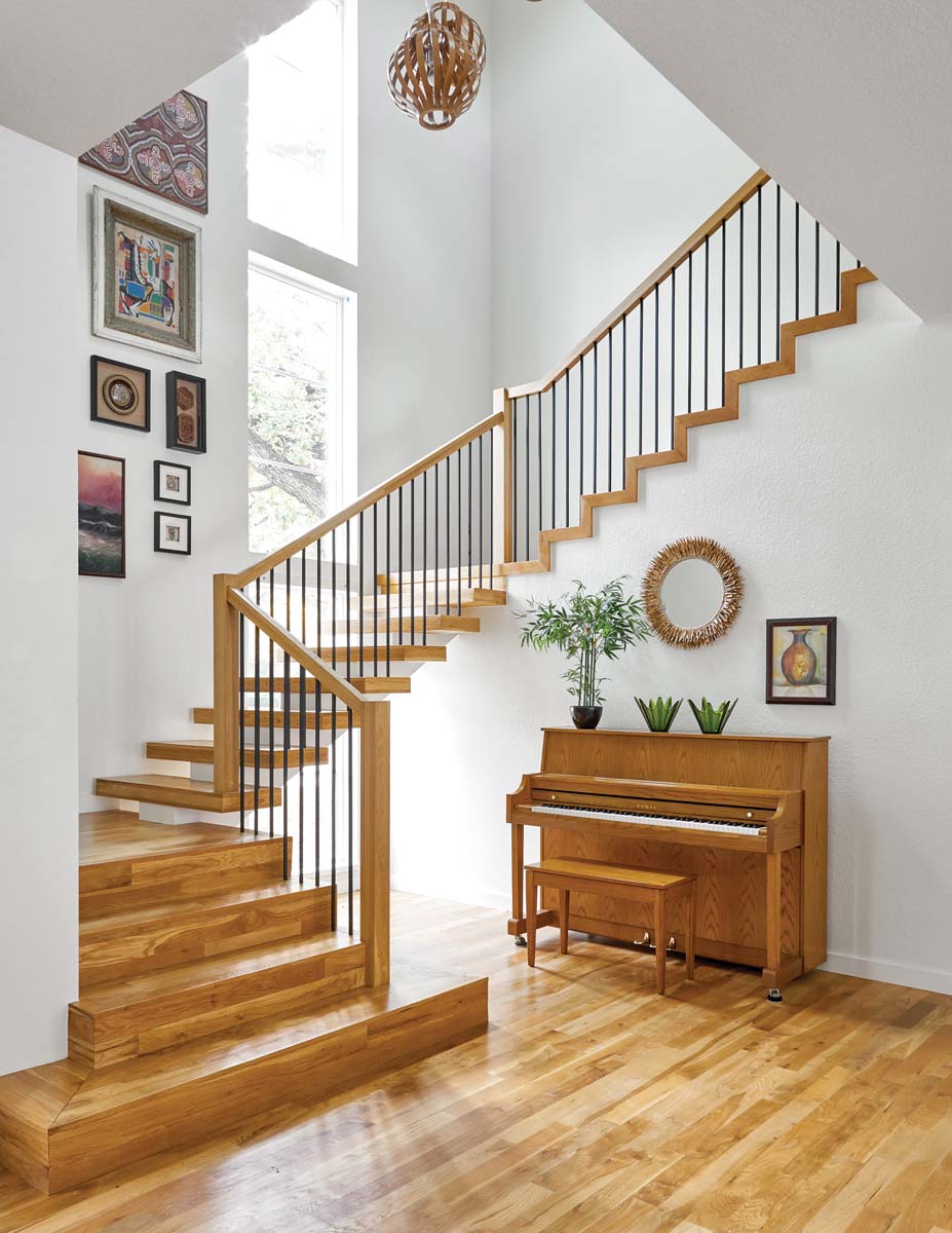
The new stairwell features a gallery wall filled with the couple’s collection of artwork, most of which received new custom frames, plus some finds from the interior designer. The accessories on and above the piano remind Krishna of the Shenoy’s years spent living in Hawaii. Staalsen combines a coconut shell mirror and Blenko glass vases with frondlike features as a nod to the islands. The bentwood pendant lamps are from West Elm.
White oak floors and large windows unencumbered by draperies keep the light balanced. The new open staircase is a focal point both inside and out, as the design feature “floats” past a dramatic 20 foot-tall window in the stair hall. The sleek combination of wood and thin metal balusters adds to the beauty of the design. A simple gallery wall and a trio of modern bentwood pendant lights resembling woven lanterns help accentuate the height.
The new kitchen, laid out in a spacious square, is perfect for cooking and entertaining, a plus because the Shenoys love good food and wine. Aside from prep areas, there’s a roomy countertop with stools on one side for informal dining and an abundance of storage space underneath. The refined custom white-oak wood built-ins designed by the architect emphasize precision, but add warmth to the room.
The couple also was thrilled that all the new windows showcase the huge oak tree in the front yard, especially from Damodar’s home office and the new cozy TV room upstairs. “In the spring and summer, it feels like you’re in a treehouse,” says Krishna.
With the 10-month remodel complete, the couple realized that the interior design needed updating, too.
Krishna knew of local interior designer Ruthie Staalsen through Facebook friends, but originally thought her work might be a bit too traditional. After hearing good things from one of Staalsen’s clients, the couple had her make over two bedrooms before committing to turning over the entire house to her.
Staalsen already was familiar with the project, as she lives nearby and had noted the remodel while driving through the neighborhood.
“It was exciting to see the transformation happen on the outside. I was thrilled to get to be part of the interior redo.”
“We were nervous about working with a designer, as we had a specific look for the house in mind,” says Krishna, “but Ruthie really listened and understood us. She created a timeless and collected look that reflects our global experiences and appeal for midcentury color and style. Her ability to use pieces we already had and find unique treasures at thrift stores really spoke to me, as well. When everything is new and shiny, it feels like a hotel, not a home.”
Working with furniture they already owned — much of it with clean, simple lines — and things the family loved, including art collected over the years and family treasures, Staalsen gave them the unfussy look they craved.
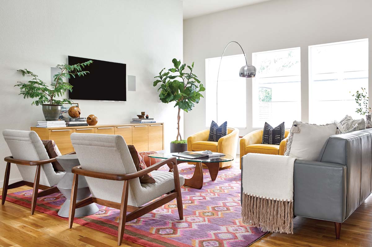
She did select new seating, casegoods and accessories for the enlarged living room. She added small pops of color and natural accents to complement the overall neutral look and reframed their artwork to give it more impact. She commissioned a local artist for a special painting, making sure it worked with the existing mix.
After winning over the couple with her bedroom redos, she applied the same design philosophy to the rest of the home.
In addition to the interior, the backyard, which backs up to a parklike space owned by the school, also got a makeover. The couple worked with landscape architect Mirka Chodakova to create a comfortable but stylish patio that complements the house. A fence with horizontal slats sets the tone for built-in seating, a modern steel and wood pergola and a small water feature, a special request from Damodar. A powder-coated custom screen with artful cutouts made by a local metal worker is a definite conversation starter.
While they wait for warmer weather to enjoy the patio, the couple is more than happy to settle into the sense of calm that now defines their home.
THE DETAILS
Architect smitharc Architects, Jason Smith, AIA, and Signe Smith, associate AIA, Dallas, smitharc.com
Builder Tatum Building Corp., David Tatum, Southlake, houzz.com
Interior design Ruthie Staalsen Interiors, Ruthie Staalsen, Grapevine, ruthiestaalsen.com
Landscape architect/patio design Chodak Design, Mirka Chodakova, Flower Mound, chodakdesign.com
Landscape installation Agravista, Roanoke, agravista.com
Custom metal patio screen Atomic Twelve Designs, Michael Broussard, Highland Village, atomictwelve.com


