A Westlake couple’s remodel of their family home created a happy ending for everyone
By Meda Kessler
Photos by Aaron Dougherty
There’s nothing like a major life event to spur on a home remodel.
In this case, Westlake residents — and recent empty nesters — Chris and DeeAnn Jeppesen were looking forward to welcoming guests for their son’s summer wedding. After all, what better place to host a party than the home where he grew up.
But a hoped-for quick project turned out to be a yearlong odyssey thanks to supply-chain snafus, weather issues and other construction hiccups.
The Jeppesens turned to Sherri Mullins, a Southlake-based interior designer, to pull everything together.
Mullins discovered her passion for interior design when she was young, creating floor plans for fun. A longtime resident of the Chicago area, she got her degree in corporate communications and, later, interior design. Much of her work was elevating the design in hotels. She also was a flight attendant for American Airlines but took time off from her career to raise three boys and travel with her husband.
After she and her family moved to Southlake, one of her early jobs was a commercial project tasking her with designing a new office for the real estate firm of Allie Beth Allman & Associates. “They wanted a more residential feel to their workplace environment,” says Mullins. One of the firm’s partners recommended her to the Jeppesens during the couple’s search for a designer. “The Jeppesen project gave me a chance to create a place that suited the clients’ vision of melding comfort with impactful design.”
“Before” photos of the multistory home reveal rooms with high ceilings and an abundance of windows. But dark finishes — stone, tile and wood — felt dated and made the rooms feel small. Even the entrance — with its heavy front door — lacked a welcoming feel.
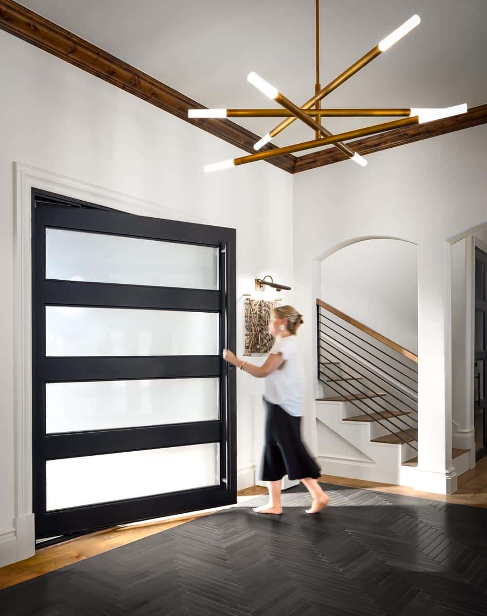
The makeover is immediately noticeable from the exterior thanks to the new pivot-style steel door with opaque glass panels, which makes a statement inside and out. For the foyer, Mullins inset Ann Sacks black graphite limestone in a herringbone pattern on the wood floor instead of using an area rug and added a Regina Andrew contemporary light fixture in natural brass.
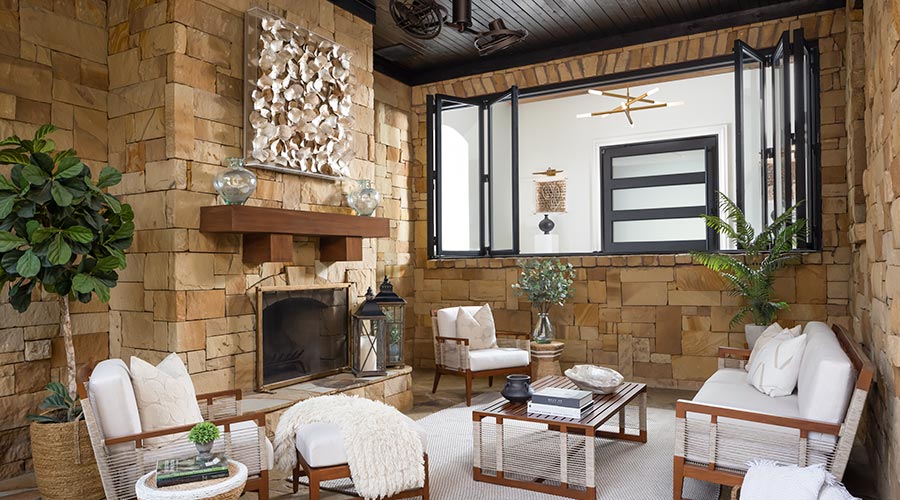
Mullins credits her clients for coming up with one of the most dramatic updates in the foyer, creating sightlines down into the lanai, part of the home’s split-level design. A massive window with accordion-style glass panels was cut into an existing wall, infusing the foyer with natural light and opening up views to the patio and backyard.
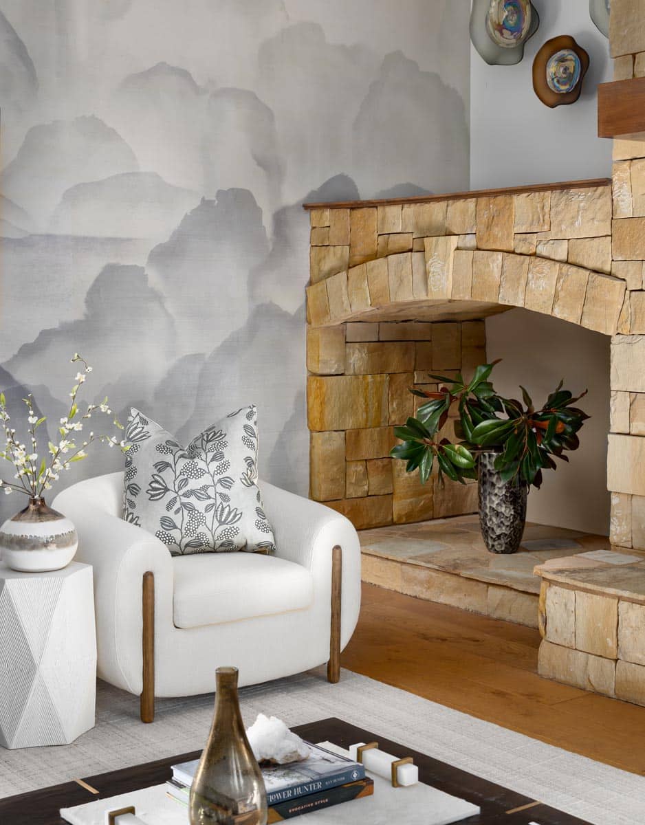
“We also added patio doors to make it a functional year-round living room,” says Mullins. She softened the rock walls and flagstone floor with stylish indoor-outdoor furniture upholstered in cream-colored fabric, art from Palecek, and a durable rug for the flagstone floor from Dash & Albert.
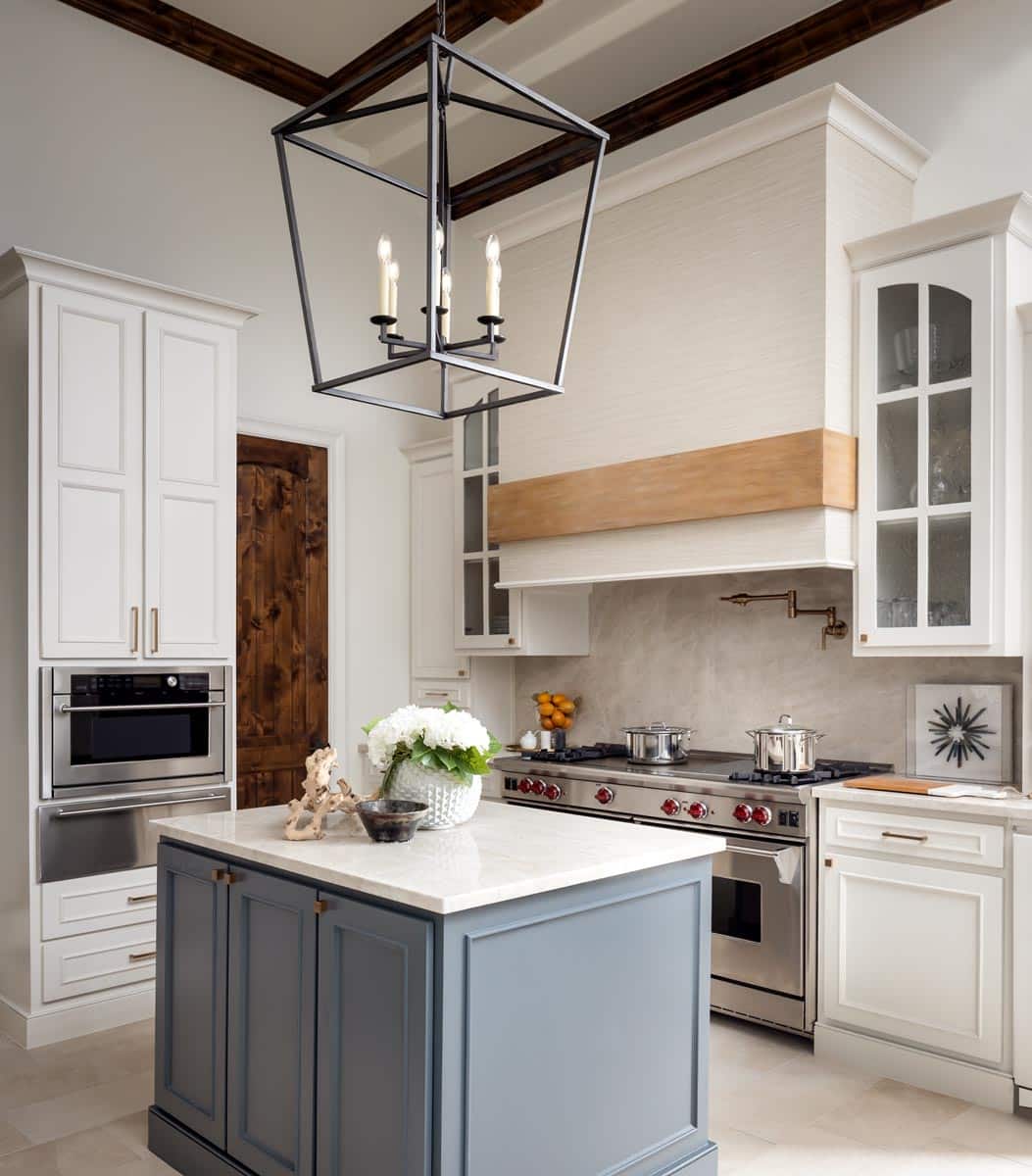
Mullins updated the kitchen by painting the dark cabinets and island and using a lighter stone for the floors, countertops and backsplash. “It’s not always necessary to demo an entire room to give it impact. Eliminating fussy details from the vent hood and covering it with a vinyl grasscloth wallpaper from Phillip Jeffries gave it an instant update.”
Mullins’ use of tactile elements such as wallpaper, tile and accessories is evident throughout. Custom Phillip Jeffries hemp wallpaper gives the adjacent family room a fresh look. In the adjacent powder room, she used the same Ann Sacks tile found in the foyer along with a unique mosaic backsplash from Artistic Tile. The existing vessel sink, formerly bronze, was refinished in silver to match the new hardware.
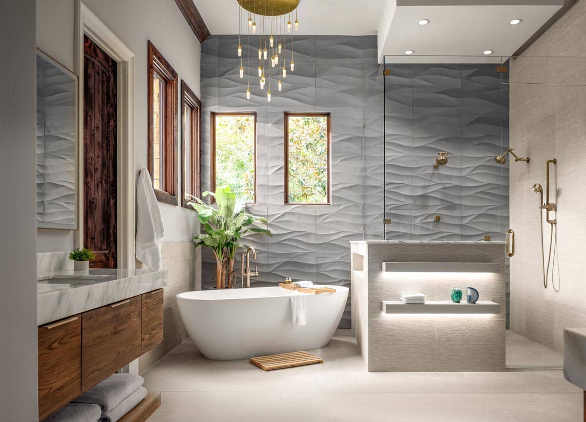
The master bathroom received the biggest makeover, creating a space for the couple to have his-and-hers vanities along with a spalike shower and bath. Gone is the mottled brown tile used on the floor and walls. Instead, textured stone and porcelain tile, from Ann Sacks and Artistic Tile, create movement and depth, especially on the feature wall behind the angled free-standing tub and newly designed glass shower. Floating vanities feature thick slabs of Calacatta Mont Blanc marble. Under-lighting on the floating shelves built into the shower’s half wall add to the ambiance. The pendant light from Global Views in satin brass with quartz crystals adds subtle sparkle. Existing wood shutters were removed from the windows, allowing for a verdant view of the outdoors.
“We started in May 2021 with plans to finish by the end of the summer. We actually finished in July 2022, a month before the wedding,” says Mullins. “Calling this a refresh is exactly what we did, as everything feels light and bright.”
THE DETAILS
Interior design Sherri Mullins, Sherri Mullins Interiors, sherrimullinsinteriors.com

