By Meda Kessler
Photos by Jen Burner
How one couple fell in love with their house all over again after learning to lighten the load and embrace a new style.
For Erin and Gary Cox, the decision to find a new style that would “spark joy” began before organizational queen Marie Kondo became an even bigger household name thanks to Netflix.
In 1999, the couple built a custom home in far west Benbrook. “Erin loved the open concept, so that was a key element,” says Gary, a retired Lockheed employee. They opted for stained concrete floors, faux painted walls, dark wood cabinetry and granite in the kitchen. “Everything was dark,” says Erin, who insisted on a frameless wall of glass in the living room that offered a view of the wooded acreage behind them.
Several years ago, they decided it was time for a change. “You reach a point where you look around and realize you have too much stuff. The thought of changing everything was overwhelming, and I didn’t have the time nor the energy to do it,” says Erin, who now works out of the home part time for a Mansfield transport company. “We vacillated for two years on whether to move or remodel before we decided to get help.”
The couple turned to Shauna Glenn, whose colorful and eclectic design style was the opposite of their look at the time.
“I admit when I looked at her website, I wasn’t sure if we would be a good fit. But she stepped in, took over, and we have never looked back,” says Erin.
Using storyboards, Shauna presented the couple with her vision of the multiroom makeover.
Gary acknowledges that he was a little dubious at first, especially when he saw plans to paint the custom wood cabinetry in the kitchen and living room. Erin was not a fan of blue, which Shauna loves. The suggestion of black faucets for a bathroom also raised eyebrows.
“But she got us excited rather than overwhelmed by the project,” says Erin.
The transformative refresh got green-lighted to include new flooring, wall treatments including paper and paint, lighting, furniture, decor and even some new construction.
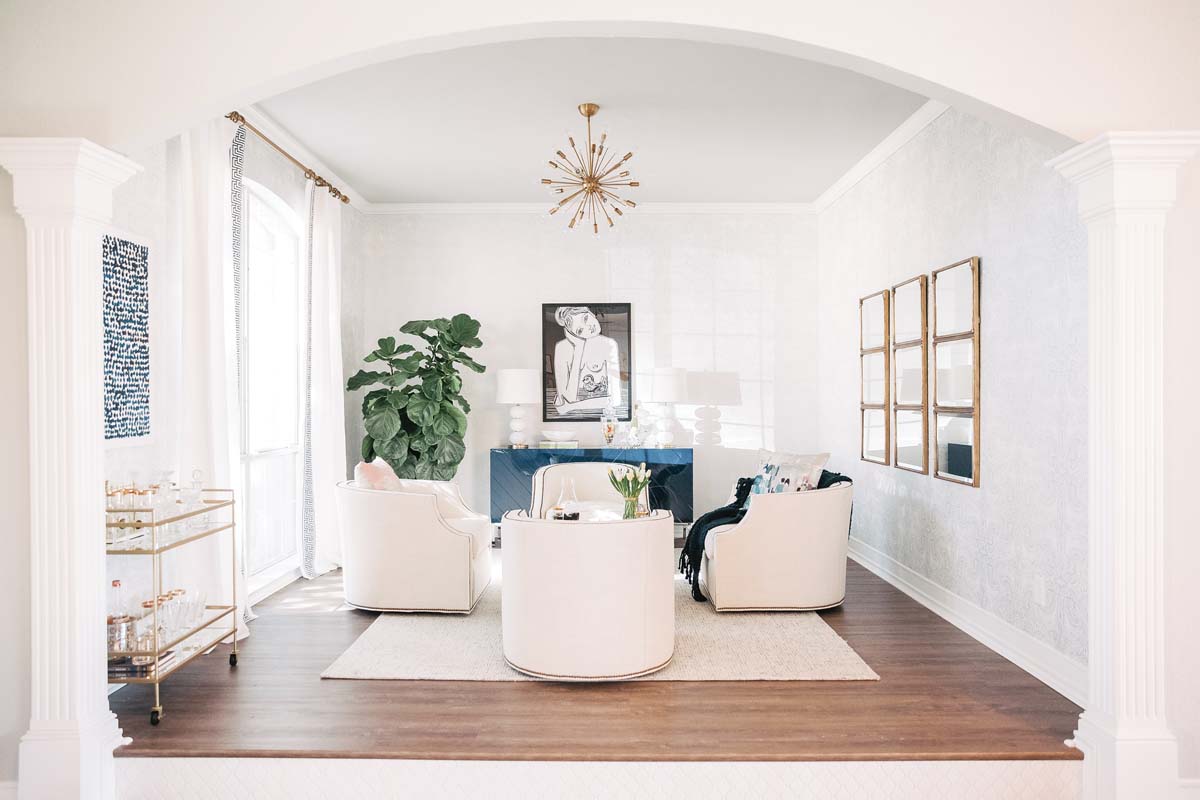
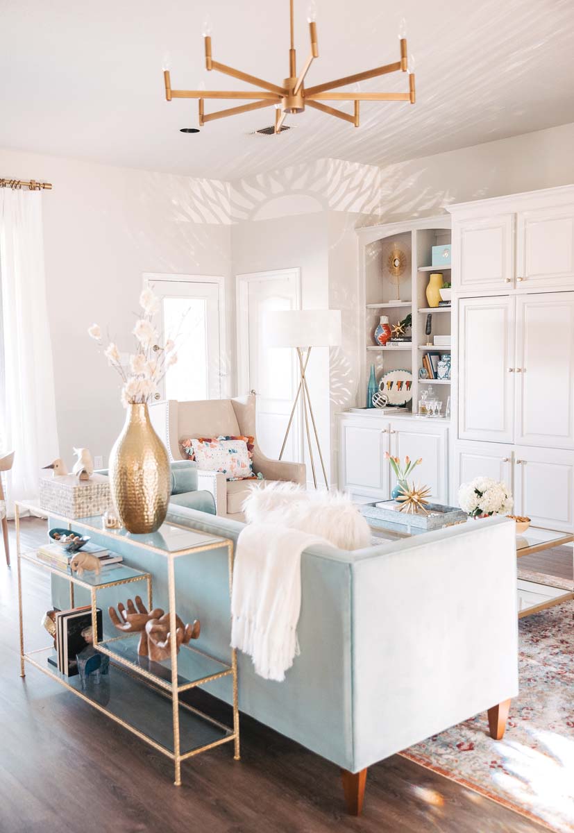
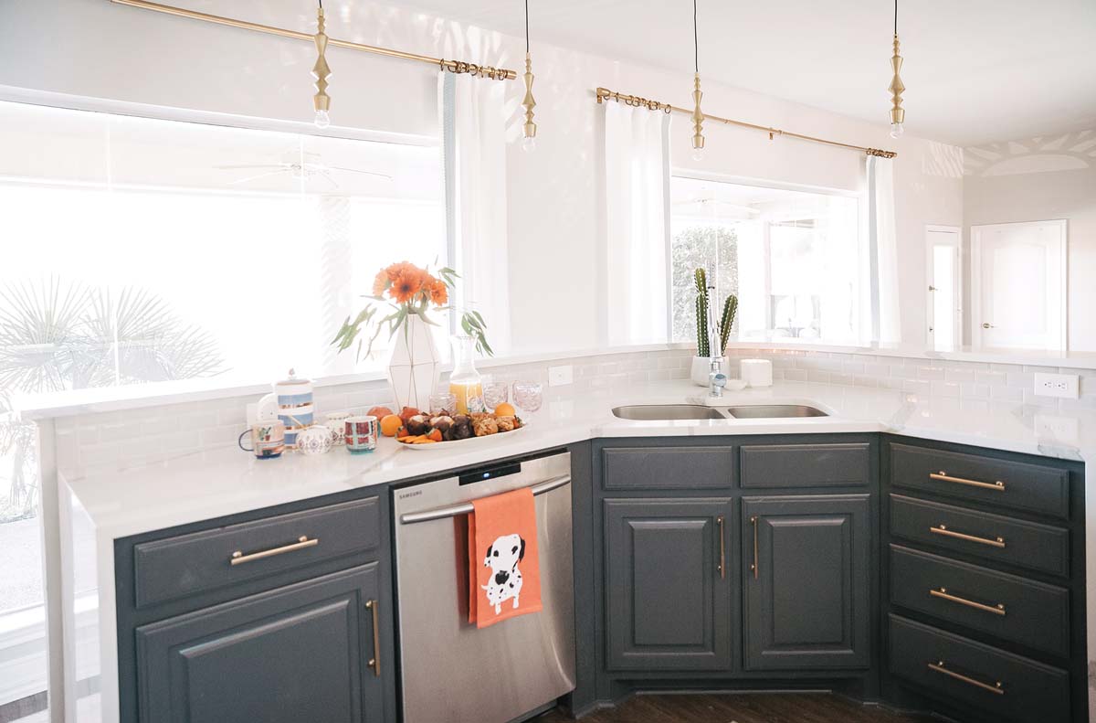
“Lighten up” was the design mantra, so all the rooms were painted in Repose Gray from Sherwin-Williams, a soft neutral. The same color was used on the built-in bookcases in the living room for a seamless look. White subway tile and white quartz counters replaced a dull tile backsplash and predictable dark brown granite in the kitchen, where the cabinets were painted in contrasting tones of white and dark gray. White window coverings were used everywhere, from the new lounge to the master bedroom to Gary’s TV room. And the master bath got a wow makeover, becoming a spalike retreat complete with a glassed-in “wet room” featuring gray-and-white Kelly Wearstler/Ann Sacks stone mosaic tile. Gold-tone accents, from drawer pulls to curtain rods to pendant lights, are found throughout the home.
An oversize leather sectional and animal prints gave way to smaller-scaled pieces upholstered in neutral colors. That’s not to say Shauna didn’t add her trademark punches of color and texture with functional pieces such as a blue lacquer buffet in the lounge and woven-leather dining chairs. Vibrant area rugs are used everywhere. Wallpaper with hints of metallic sheen provides a bit of glamour.
Shauna also helped the Coxes look at how they used — or didn’t use — each room. “When you entered the home, there was a formal dining room to the left that wasn’t being used for much of anything. Since the couple enjoys informal get-togethers, we turned it into a chic lounge area with comfortable seating. The open living space allowed us to place a dining table in front of the glass wall.” Now, says Erin, she and Gary sit there whenever they get a chance.
The master bathroom, separated from the bedroom by a curtained doorway, was drab and dark, with odd placement of everything from tub to toilet. A modern sliding door replaced the curtain, and the space was reconfigured to create the glass-walled wet room with shower and a freestanding soaking tub. A new window adds welcome natural light. A separate water closet was carved out of existing space, as were his-and-hers closets.
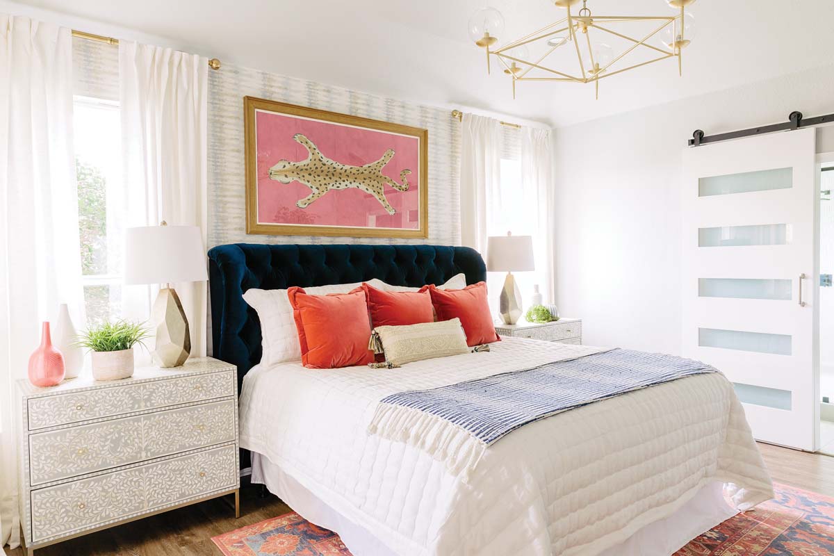
The bedroom also is an oasis of neutrals, save for the pop of a blue velvet tufted headboard, vibrant throw pillows on the bed and a colorful rug.
Seeing the project come together over four months was an eye-opener for the couple. Gary, who was home during the day, could check in on the progress daily.
Erin says she would come home and send Shauna “OMG” texts right away after each transformation reveal. She still sends impulsive “LOVE my house” texts to this day. “We immediately felt lighter, physically and mentally, and we still do today.”
THE DETAILS
Design and styling Shauna Glenn, shaunaglenndesign.com
Tile installation Natural Stone and Granite, 9840 Camp Bowie W. Blvd., Fort Worth, 817-244-1600


