By Meda Kessler
Photos by Brian McWeeney
Architect Brandon Allen
Interior design Anissa Allen Allen Architecture, allenarc.com
Builder Matt Awbrey, Matt Awbrey Construction, mattawbreyconstruction.com
It was an architect-client relationship that was meant to be.
When Brandon and Anissa Allen — he an architect, she an interior designer — put their Ryan Place home up for sale, it immediately caught the eye of Emily and Christopher Smith. The young couple was looking for a small but stylish home, and the Allens’ remodeled 1948 house fit the bill.
A featured project on the 2013 AIA Fort Worth Homes Tour, the house featured a clean and modern interior with a period exterior characteristic of the neighborhood. The Smiths were outbid, but a friendship began.
Cut to last year when things came together for the Smiths. The couple found a lot in Ryan Place that they liked, and the Allens created a clever infill design for a home just right for the space.
Budget-minded but wanting something modern with clean lines, the homeowners got everything they wanted thanks to the Allens’ vision and practical experience with small spaces.
The result is a 1,850-square-foot home with three bedrooms, 2½ baths, a two-car garage and loads of style, and it was built in six months.
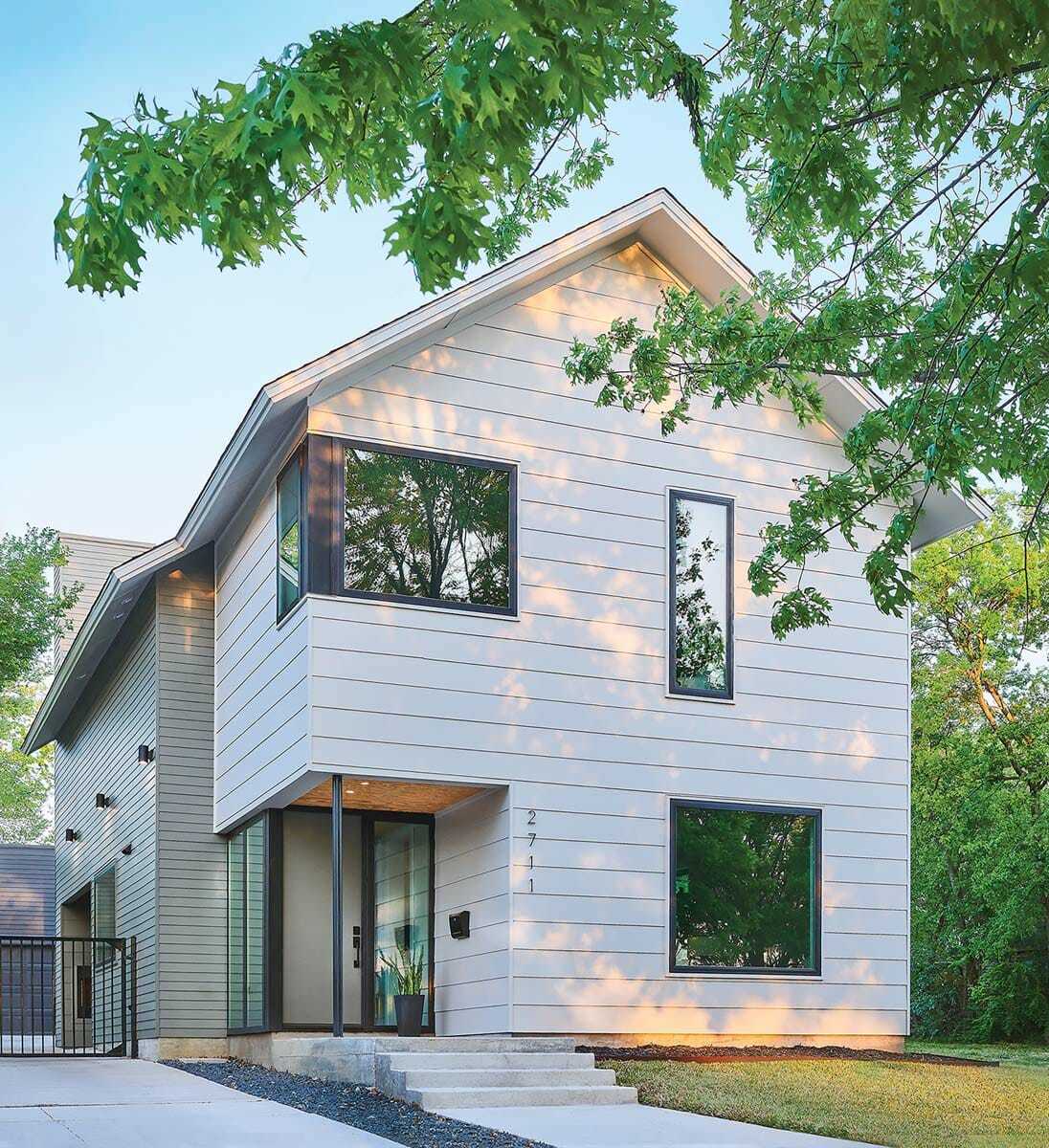
“The established street is a mix of older homes, some of which have been remodeled. We knew the Smiths’ house was going to be the only two-story on the block and, in order to respect the context of the neighborhood, we took special measures to minimize scale,” says Brandon.
He came up with what he calls a “budget box design” using simple materials for most of the house and splurging on important details such as windows whenever possible. Smooth cement-board siding, durable and rot-resistant, eliminates the need for constant scraping and painting that comes with wood. The classic gabled house is punctuated by a trio of windows, including one that wraps around a corner.
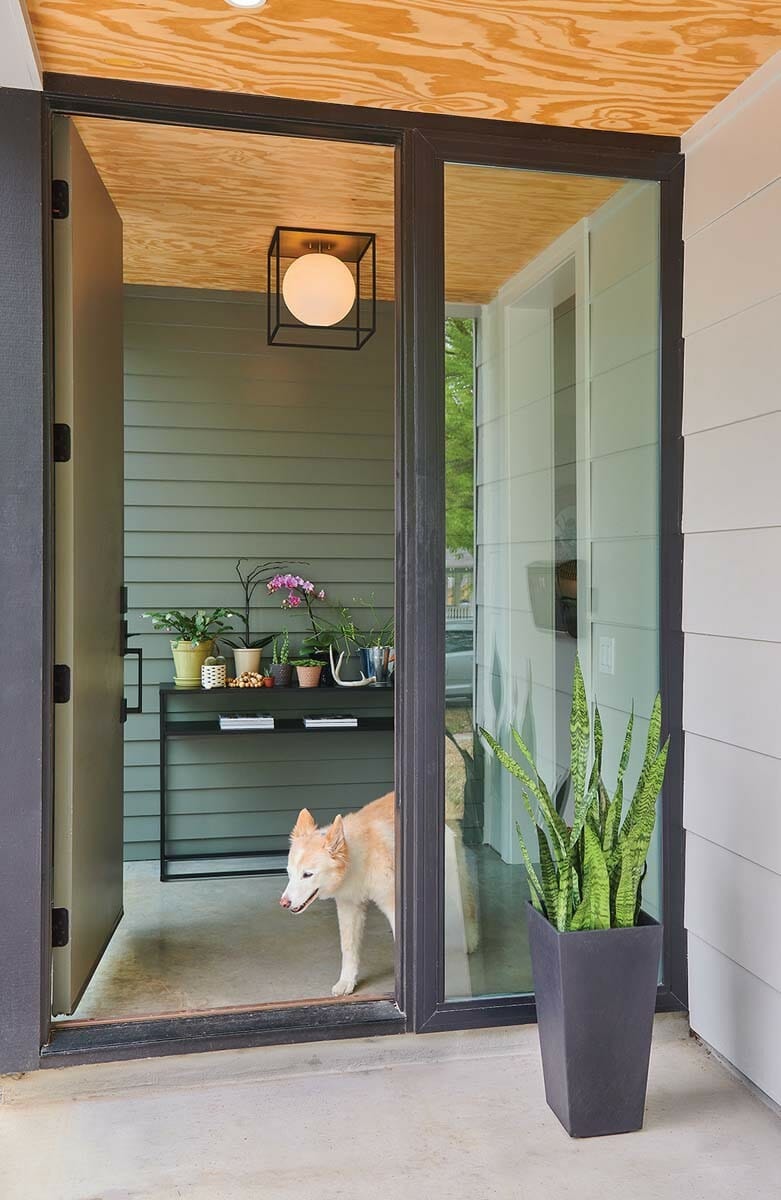
An interesting entryway is the result of a “notch” cut into a corner, which creates a small covered porch. The cement-board siding and plywood for the entry ceiling extend into the small foyer, creating a seamless visual from exterior to interior.
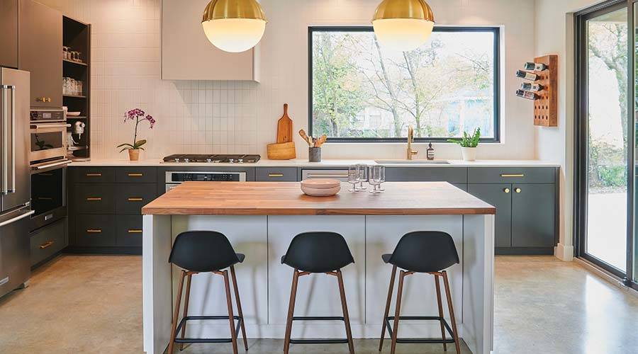
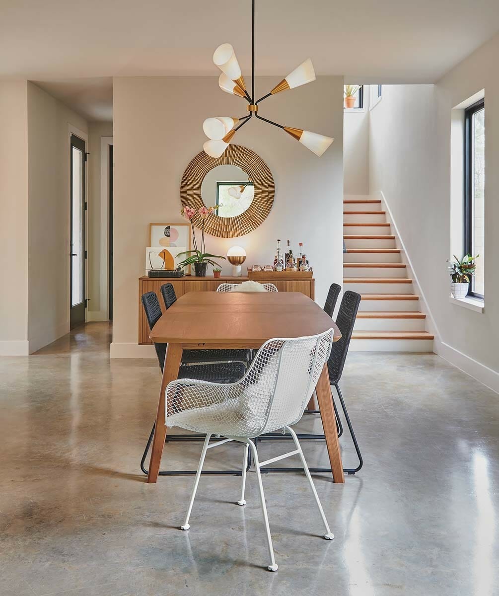
Inside, waxed concrete floors on the first floor provide a neutral canvas for the couple’s simple but stylish furnishings. The open kitchen features a large window centered over the sink, and white subway tile used vertically adds visual impact. Custom cabinets and luxe-looking hardware pair well with Ikea’s butcher block topping the kitchen island. Near the back door, Brandon carved out a small mudroom plus a stylish powder room with dramatic black tile.
Climb the stairs to the second floor — follow the light provided by windows in the stairwell — and pause on the spacious landing that the Smiths use as a reading area. The guest bedrooms are in the front of the house, along with a laundry room and a guest bath. The master suite is in the back, where lounging in bed allows one to stare out the window at the sky and surrounding trees. A row of beams, painted the same color as the walls, stretches across the bedroom ceiling and helps give the room a sense of scale. A skylight brightens the master bath, which holds a spacious walk-in closet.
In fact, it’s the light that draws you in no matter where you are in the home.
THE TAKEAWAY
Details Cost-efficient engineered hardwoods on the second floor look like the real thing. An Ikea butcher block countertop on the custom-built island is another budget-saving solution that looks great. Plywood, rather than cedar, for ceilings in the entryway and foyer provide a welcoming warmth in an attractive and creative use of lower-priced materials.
Design Windows judiciously placed throughout the house visually expand spaces such as the stairwell and powder bath. A foyer creates an inviting entryway in a small home. The covered patio on the side of the house features a working gas fireplace; the chimney adds an architectural element to the back of the home.


