Age Appropriate
By Babs Rodriguez
Photos by Gary Logan
A transitional kitchen remodel respectfully connects a historic home to a recent addition and wins the hearts of the homeowners along the way
Sometimes, the help you need for your kitchen remodel can be found at the end of your driveway. At least that was the case for Heather Radler, who feels fortunate that’s where she found neighbor Stacie McCans, designer/owner of Fort Worth’s Paxton Place Design. Heather and husband Geoff bought their 1939 bungalow in 2008, the same year that the McCans bought the house catty-corner across the side street where both couples’ garages sit. “If our front doors faced, it’s possible we might not have met,” Heather says, laughing.
But whereas enlisting Stacie’s help in the redo was central to its success, it was the pandemic that gave the Radlers an unexpected boost in finishing a home remodel begun years before.
“Geoff and I met when we were living in condos just around the corner,” says Heather, who moved to Fort Worth from Omaha, Nebraska, to study to become a nurse anesthetist. Geoff, who grew up in Syracuse, New York, relocated to work in oil and gas. “He asked me out for a couple of years,” she says. “I don’t know why I always said no, because five months after our first date we were engaged.”
A month later, in 2008, they bought their house in the Monticello neighborhood, which they’d come to love for its mature trees and welcoming porches. But while both are cooks, the kitchen remodel sat on hold for a dozen years as they completed other projects. The first order of business was repainting the interior. “Everything in the house was yellow,” Heather says. “And that is not my favorite color.”
A very attractive home emerged, but the Radlers knew what was going to make them happiest — transforming the segmented kitchen that linked the original house to the family room addition where they spend most of their time.
“We did the kitchen last because we knew how disruptive the remodel would be,” Heather says. Then, just as they pulled the trigger, COVID hit. The silver lining: The couple had more time at home. They decided to do the to-the-studs demo themselves. Heather had a strong vision for what she wanted, but when she felt she needed some help, the intersection of those driveways proved serendipitous. Stacie, who joined us to talk about the remodel, says, “Steve and I were remodeling our home at the time, so my sign was out.”
“I had seen it,” Heather says. “So, I shouted over to her, ‘Y’all do kitchens?’ ”
Both women say that a really tight collaboration followed.
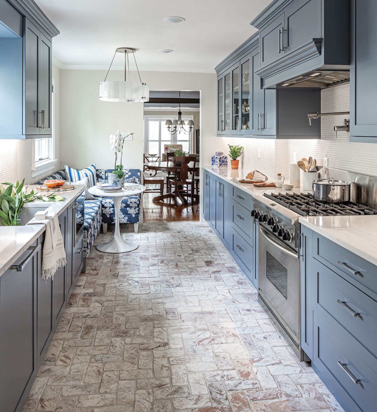
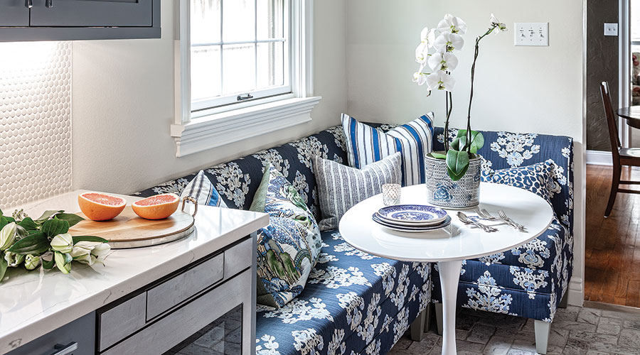
Stacie’s team agreed with the Radlers that the choppy space bracketed in doors had to be blown open. The homeowners hired Matthew Radler, Geoff’s brother, as their contractor to assist in removing breakfast and laundry room walls and doors and to widen the entries at each end. In what is now a sunny corner, a narrow vertical window was replaced with a broad one, and original built-ins were replaced with glass-front cabinets ideal for displaying china Heather inherited from her great-grandmother. An upholstered banquette embraces an oval tulip table that is comfortable for eating breakfast or working at home. The oversize floral print pulls from the blue chosen for the kitchen cabinets.
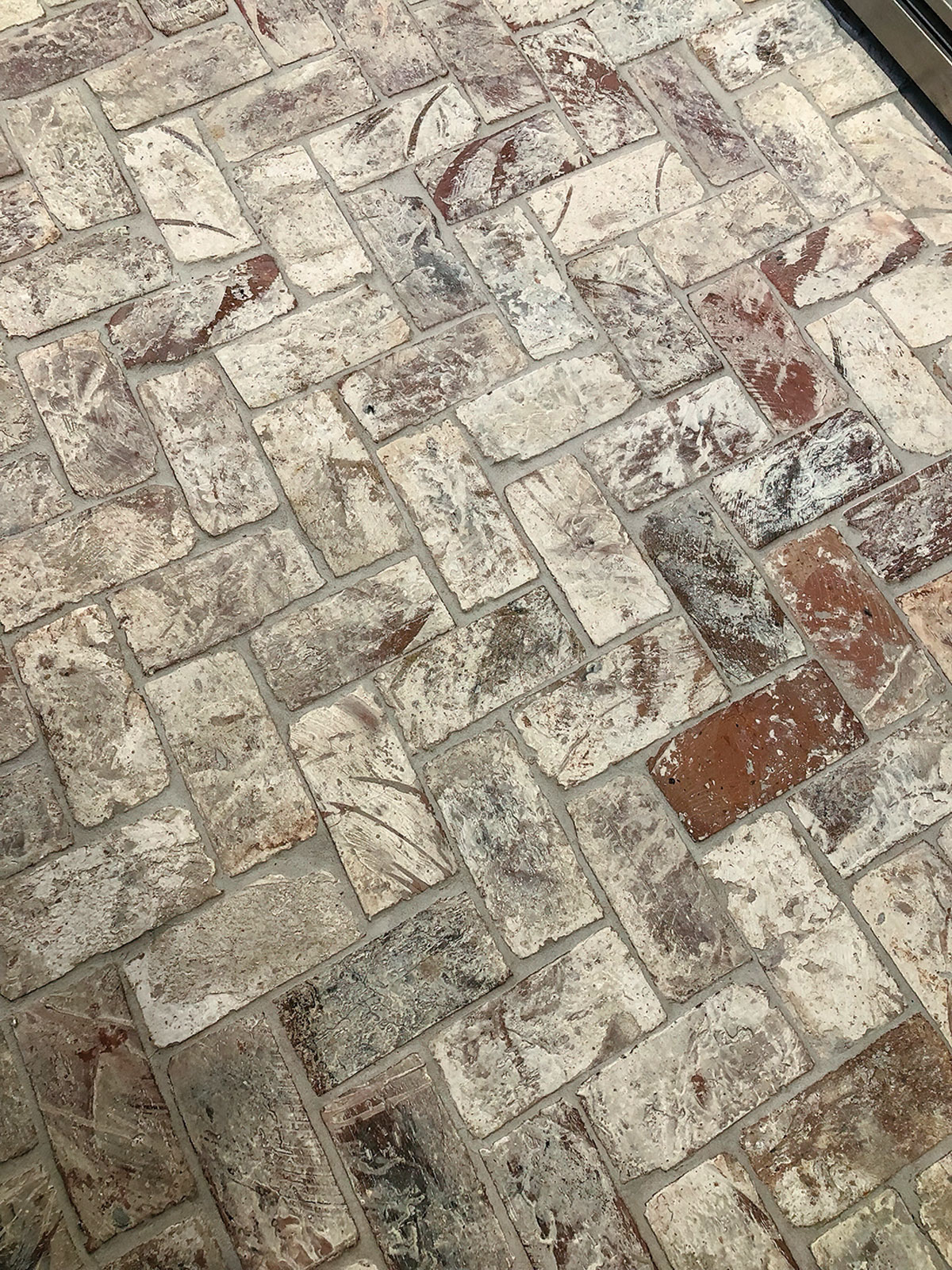
Central to the uplifting transformation of the dated and choppy kitchen, a reclaimed brick floor with custom bleached wood grout has a historic resonance, while the whitewash finish contributes to the brightness of the remodel. Subtle textures in the space add interest without distracting from its newly streamlined feel.
The cabinet color is central to much of Heather’s delight with the transformed kitchen. “I love blue. And I wanted to wash away all that yellow with cool, coastal tones,” she says. Stacie chose Sherwin-Williams Storm Cloud for its calming gray undertones. It is a blue that redefines neutral and promises a long-term appeal.
The serenity of the space doesn’t mean it isn’t surprising. The whitewashed reclaimed brick veneer floor tile from Fort Worth’s Bottega Design Gallery delights everyone who sees it. “We wanted something that resonated with the home’s history,” Stacie says. Heather enjoys the visual connection between the original hardwood of the living room and the hand-scraped wood floors in the addition, now that the sightline through the galley kitchen is open. “It marries the segments of the house,” she says. Deciding how to lay the bricks took deliberation. “We finally went with a cross between a herringbone and a basketweave,” Stacie says. The pattern is another nod to the home’s age, with a transitional tweak.
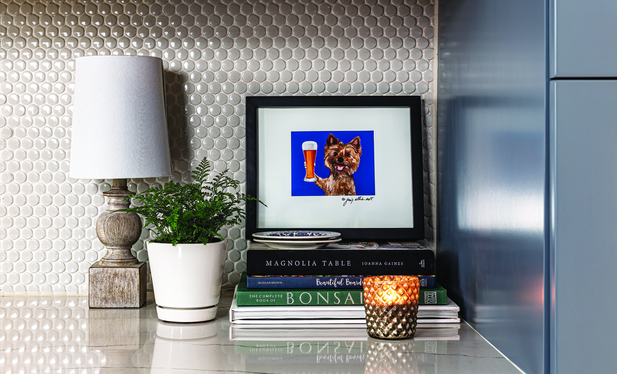
The elongated feel of the space is enhanced by undulating but understated veins in the Cambria matte quartz countertop. Adding blue cabinet fronts to the refrigerator and dishwasher further streamlines things. Greige penny tile adds a dash of texture to the backsplash but in a whisper of gray/beige, and there is a historical echo in this finish, too.
Increased functionality comes via a buffet counter added beneath the display cabinets, a microwave drawer, and a pot filler installed above the commercial-style six-burner gas KitchenAid range, a workhorse that the Radlers chose not to replace. The result is a light and bright transformation that remains true to the original spirit of the home. Heather says simply, “It is just right.”
“I can’t tell you how often my husband or I will be making dinner and shout out, ‘Honey, I love our kitchen.’
RESOURCES
Appliances Expressions Home Gallery and Ferguson Bath, Kitchen & Lighting Gallery expressionshomegallery.com fergusonshowrooms.com
Banquette Ballard Designs ballarddesigns.com
Countertop Cambria Ella Matte Quartz Luxury Series cambriausa.com
Custom cabinets Innovative Cabinet Creations innovativecabinetcreations.com
Interior design Jessica Schmidt and Stacie McCans, Paxton Place Design paxtonplacedesign.com
Paint walls, Sherwin-Williams Oyster White; cabinets, Sherwin-Williams Storm Cloud; ceiling/trim, Benjamin Moore Simply White sherwinwilliams.com benjaminmoore.com
Pendant light Rejuvenation rejuvenation.com
Tile Bottega Design Gallery bottegadesigngallery.com

